Barings
Adapt
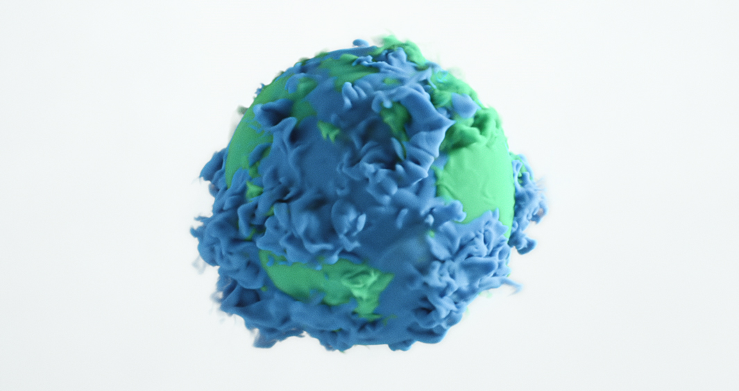
Working closely with Luquire George Andrews, Mill+ created this complex VFX piece for Barings featuring metamorphic liquid simulation of their logo.
Production Company
Mill +
Director:
Aidan Gibbons
Agency:
Luquire George Andrews
Mill +
Director:
Aidan Gibbons
Agency:
Luquire George Andrews
Read MoreRead Less
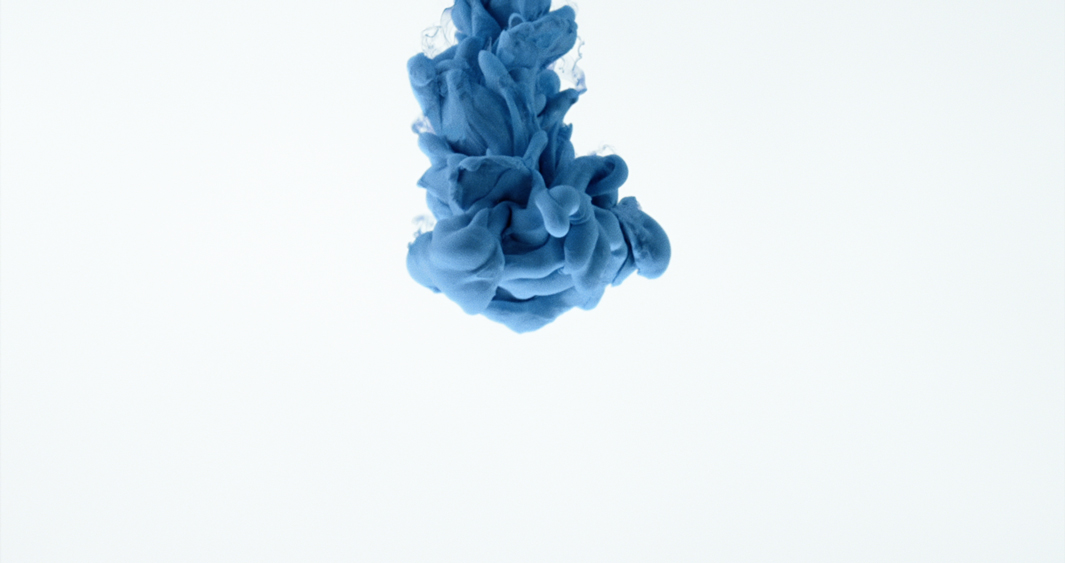
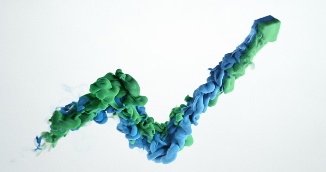
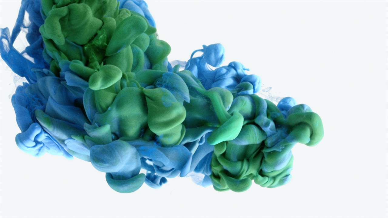
Using Baring’s iconic blue and green brand colours, the spot begins with a single blue droplet as it fluidly transforms into an abstract stream of billowing colour, leaving a trail behind and eventually reforming to make up the brand’s distinctive logo.
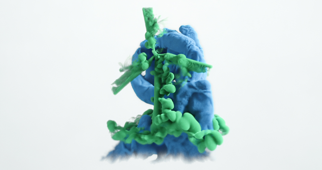
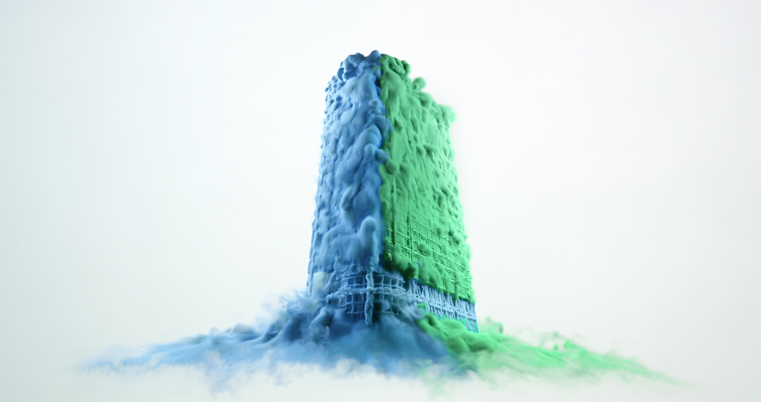
The CG liquid morphs into a building construction before swooshing into a propeller all nodding to the adaptability of the brand’s financial services.Mill+ Director Aidan Gibbons explains, ‘Luquire George Andrews presented us with a hugely ambitious script for Barings, involving the interaction between two different colours of paint.
Barings prides itself on its ability to adapt to meet clients’ evolving investment needs and I wanted to boil the essence of that idea down to a simple but visually stimulating and fluid animation.
Technically, it was quite the challenge as it was always important to us that the paint looked and reacted to physics realistically. The mixing of paint and water is so naturally beautiful that we didn't want to toy with it too much. We wanted to reproduce and be faithful to their interaction as accurately as possible.
To help us achieve this, we had a Live Action shoot. We filmed real paint in water tanks to gather lots of reference, but we also used some of the shots from this in the final film too. Our incredible Houdini FX, animation, compositing and colour grading artists used that reference allowing the rest of the project to come together naturally.’
BARINGS IS A $280+ BILLION* GLOBAL FINANCIAL SERVICES FIRM DEDICATED TO MEETING THE EVOLVING INVESTMENT AND CAPITAL NEEDS OF OUR CLIENTS.
CreditsCredits
Agency
Agency: Luquire George Andrews
Producer: Halle Griffee
Creative Director: Todd Aldridge
VFX & Design
VFX & Design: The Mill
Producer: Angela Toner
Production Coordinator: Ellie Joseph
Creative Director: Aidan Gibbons
2D Lead Artist: Stefan Susemihl
3D Lead Artist: Paul Donnellan
2D Artists: Rafael Vormittag, Eleanor Risdon, Leandro Vazquez, Sam Wood, Jose Caballero
3D Artists: Adam Darrah, Sebastian Braende, Jack Harris, Finlay Crowther, Rob Holmes, Francesco Pelosi, Jesus Parra, Antoine Mariez, Michael Hunault, James Hansell, Tony Atherton, Joshua Curtis, Stephen New
Matte Painting: Cameron Johnson
Design and Print: Ross Urien
Art Department: Matt Ivin, Hema Sabina
Online Delivery Artist: Rob Meade
Colour
Colour: The Mill
Colour Producer: Dan Love
Colourist: Mikey Rossiter
Colour Assist: Josh Bohoskey
Colour Producer: Dan Love
Colourist: Mikey Rossiter
Colour Assist: Josh Bohoskey
Editorial
Editing Company: The Mill
Editor: Will Barnett
Editor: Will Barnett
Production Company
Production Company: Mill +
Directors: Aidan Gibbons
Executive Producer: Ollie Allgrove
Producer: Terri Wood
Production Assistant: Lucy Hawes
Production Assistant: Lucy Hawes
Shoot Supervisors: Paul Donnellan, Andre Bittencourt
Director of Photography: Tim Spence
Director of Photography: Tim Spence
Stills